Elisa Viihde
During the Spring Semester at Aalto University, for the Course CS-E5210 - Usability Evaluation (), we were tasked to conduct a Usability Evaluation for Elisa on ElisaViihde, their streaming and video rental platform (). Elisa is a telecommunications, ICT and online service company and a market leader in Finland. The purpose of the Evaluation was to discover possible Usability issues that users with specific needs might encounter using the platform. The target user group, chosen for the Evaluation, was visually impaired, but not completely blind, users.
My Roles
Conduct an Expert Evaluation, using well known heuristics such as Nielsen's 10 general principles for interaction design () and WCAG to detect accessibility issues ().
Conduct an Empirical Evaluation, with a user belonging to the target group, on the platform.
Discussing and reporting results with the teachers and the company mentor.
Challenge
The original task proposed by the company was to study their new Design System (a collection of component and styles ideated for branding the company websites and applications) and identify possible issues that users might be facing. Elisa is a company operating in the telecom sector and offers services to different user groups (including old people, people with disabilities, and people with lower levels of education) thus it is important to ensure that their resources are accessible from all these categories of users. For these reasons we decided to focus on visually impaired users, that are still able to enjoy a movie or a video, but might have trouble with the interface to rent/buy them.
Approach
After an initial research phase, where we researched what are the technologies mostly used by visually impaired users to access and navigate the Internet, the amount of people using those technologies, and the pages that received the most traffic by this users, we started the Usability Evaluation with the Expert Evaluation phase.
First, we defined the two Research Questions:- What kind of accessibility issues do people with special needs face using the main navigation of Elisa Viihde?
- What kind of usability issues do people with special needs face in the customer journeys laid out by Elisa?
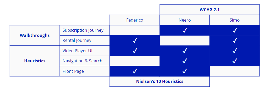
- Nielsen's 10 general principles for interaction design () that allowed us to verify the extent of the usability of Elisaviihde for all its users, without limiting our scope too much to the visually impaired only.
- WCAG () to understand which level of compliance the webpage was reaching and to better target our user group.
- Subscription: the user subscribes to "Aitio" (), a Netflix-style streaming service, from the dedicated page.
- Rental: the user rents a movie from the rental section
- Video Player UI: the buttons used to control the volume, to play/pause/stop the video, and so on, present in the video player.
- Navigation and search: to what extent the search box and the navigation elements are accessible for people using alternative input methods (e.g. keyboard only navigation).
- Front page: overall usabily and accessibility of the front page.

After the Expert Evaluation, we proceeded with the Empirical Evaluation phase. We kept the same Research Questions to gather additional insights. We recruited a total of 4 users, belonging to our target user group, that were tasked to complete the same customer journey defined for the Expert Evaluation. We opted to let every user use their own devices and set-up, to avoid possible issues with the instruments and to let the user perform at their best, using the technologies they were already familiar with.
The Table below shows the users that took part in the Empirical Evaluation phase.| # | Details | Technologies | Notes |
|---|---|---|---|
| 1 | Visually impaired | Mac laptop + OSMagnifierTool + Mouse + Keyboard | Didn't speak Finnish, had to be helped to understand the interface. |
| 2 | Visually impaired | Apple iPad (2nd or 3rd generation) as well as a newer iPhone, both with a software magnifier. | They had experience with ElisaViihde mobile app, but not with the website. As the Elisa Viihde website failed to work on the user's iPad, we conducted the test using their iPhone. |
| 3 | Blind* | Windows laptop with screen-reader. | Used only keyboard and auditory feedback. |
| 4 | Visually impaired with Aniridia* | Apple iPad with software magnifier and smart inverted colors. | Previous experience with ElisaViihde mobile app. |
*Blind user accepted for the test due to the low number of sign-ups.
*Aniridia: an eye disorder which causes reduced sharpness of vision and increased sensitivity to light.
Results
We provided the company (and our teachers) with a full report, with detailed findings obtained from our analysis; additionally, we included some suggestions on how some elements might be designed to address some of the issues highlighted. We know that some of our suggestions were implemented in their website. The final report, with all the results and findings from our evaluation, includes company private information, thus cannot be published here.
EXAMPLE OF DESIGN SUGGESTION
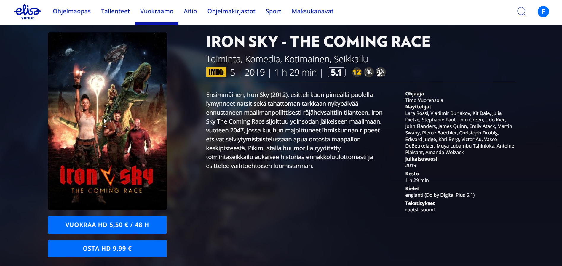
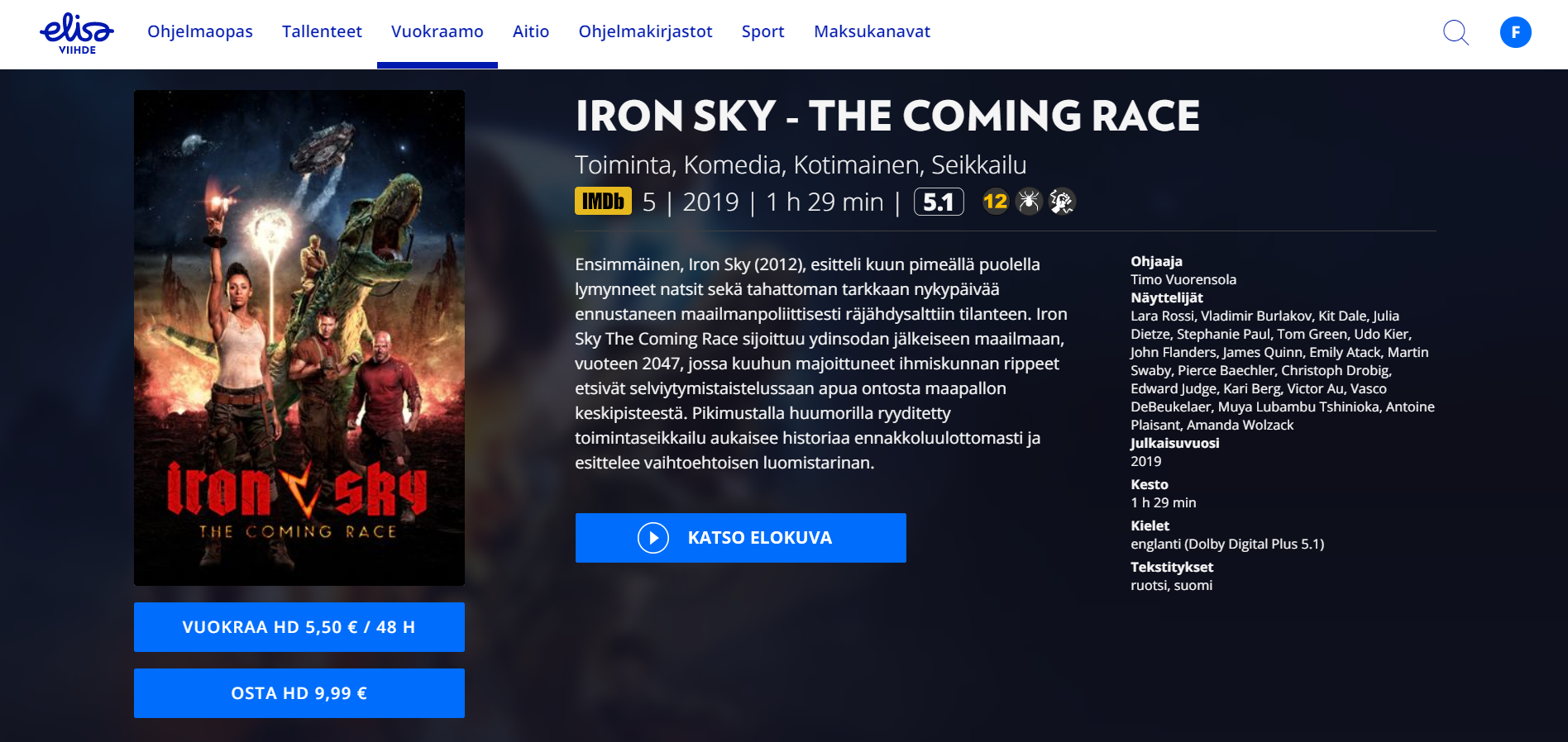
Below an example of design suggestion we provided the company with: our tests showed that users were having troubles in finding the play button after purchasing or renting a movie. For this reason, we moved the play button below the description of the movie, since in that area there is an higher contrast between the background and the button itself. Additionally, we labeled the button with a text label (in Finnish, "katso elokuva" means "watch film") that can be searched in the page.
Team: ElisaViihde
Our team was composed by 3 members (including me); every member had different areas of expertise, different culture and background.
Team ElisaViihde:
- Federico - Italian
- Neero - Finnish
- Simo - Finnish

