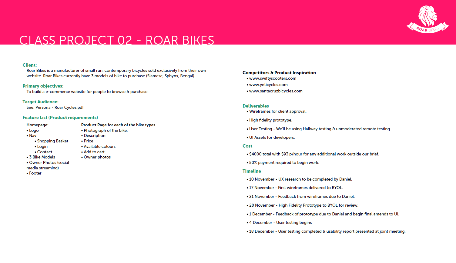
Roar bikes
In the Spring 2020, I took part in a Udemy class about Adobe XD by Daniel Walter Scott a certified Adobe Instructor and Professional.
This course taught me how to use Adobe XD, how to create interactive prototypes, design specifications, and how to present my work with realistic mock-ups made with Adobe Photoshop.
During this course I created a total of three prototypes; one was the same of the instructor, to follow along, one was for practice, and the last one (Roar Bikes) was the final project.
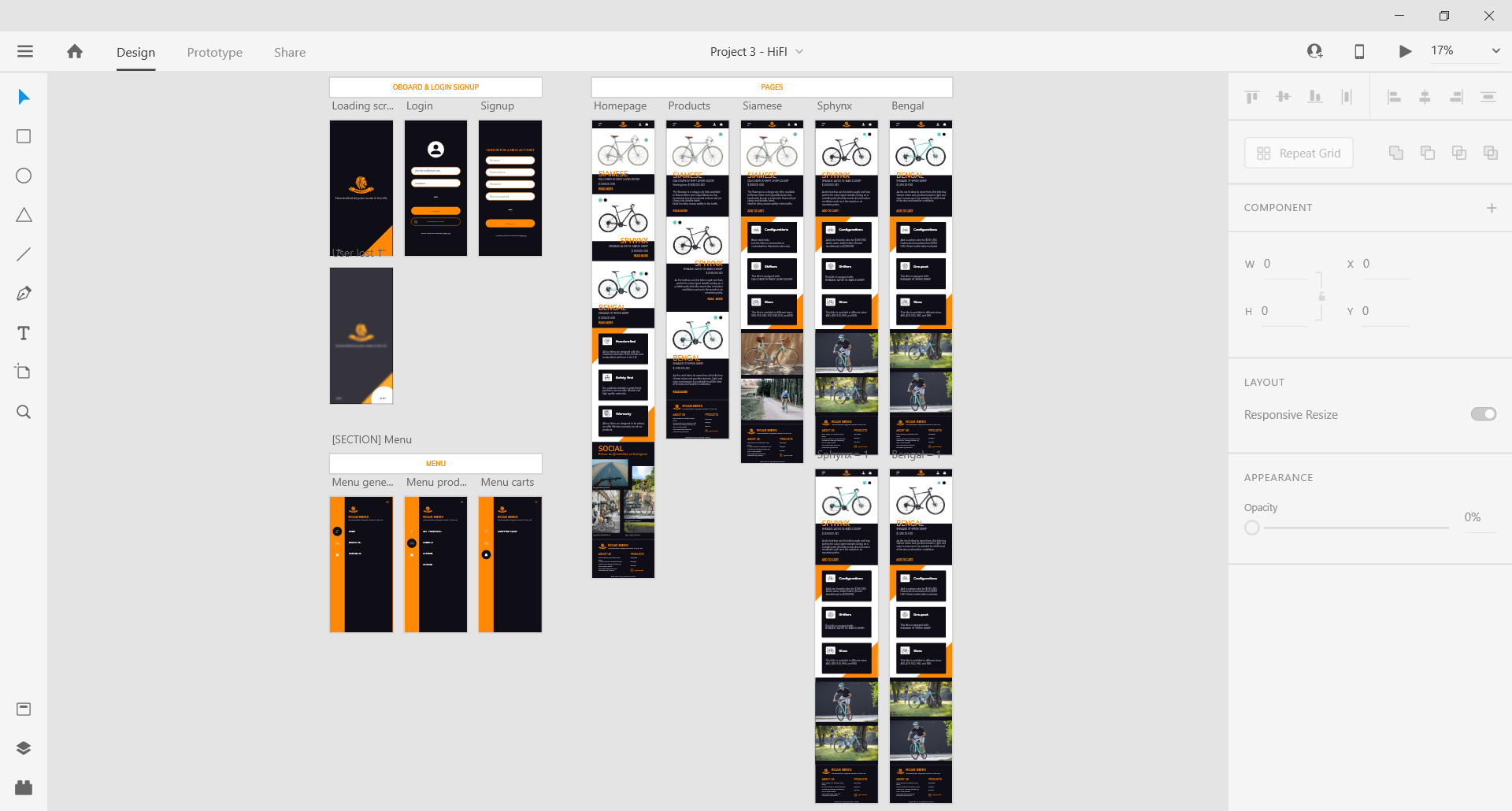
Roar Bikes is a fictional e-commerce website where users can check out their products (3 bikes) and purchase them.
Challenge
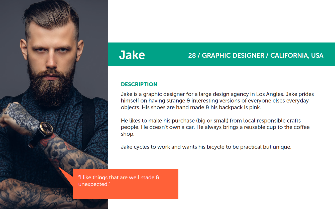
The task was to apply all the methods and techniques learnt during the course; micro-interactions, popup or modals, login and sign-up pages, and low fidelity wireframes to name a few. I was given by the instructor a small brief with the list of the features to be implemented and a persona, Jack, to design for. The only graphic asset available was the logo.
Approach
Initially, I got acquainted with the persona and the features needed; since I decided to develop a smartphone application,
I looked at other real e-commerce websites to understand their look-and-feel and the they had in place.
Then I started prototyping using low fidelity wireframes, to decide the organization of each page and the components needed to realize them.
The low fidelity wireframes included some navigation and interactivity to better visualize the overall final product and to
also test how the pages were related to each other.
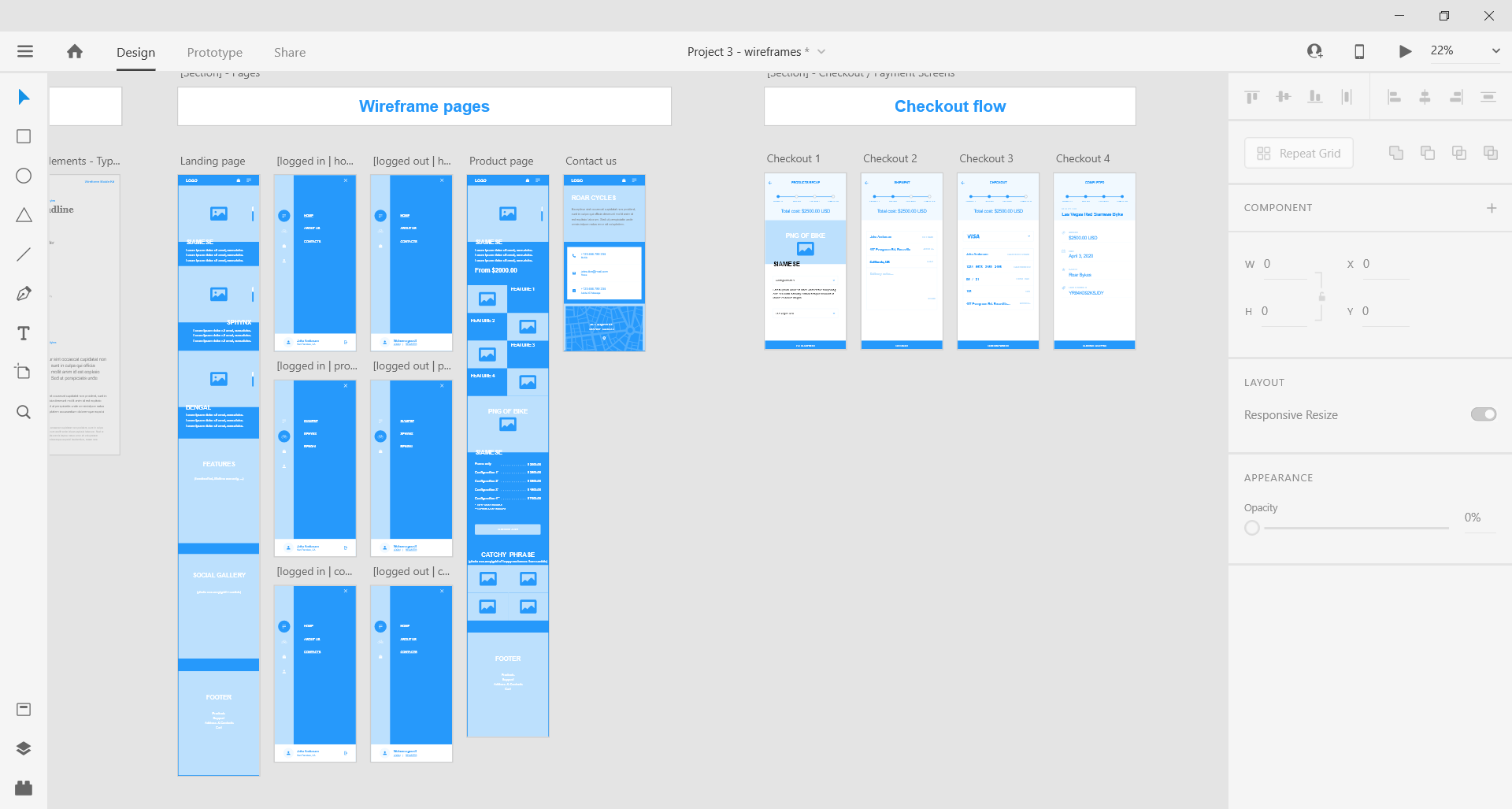
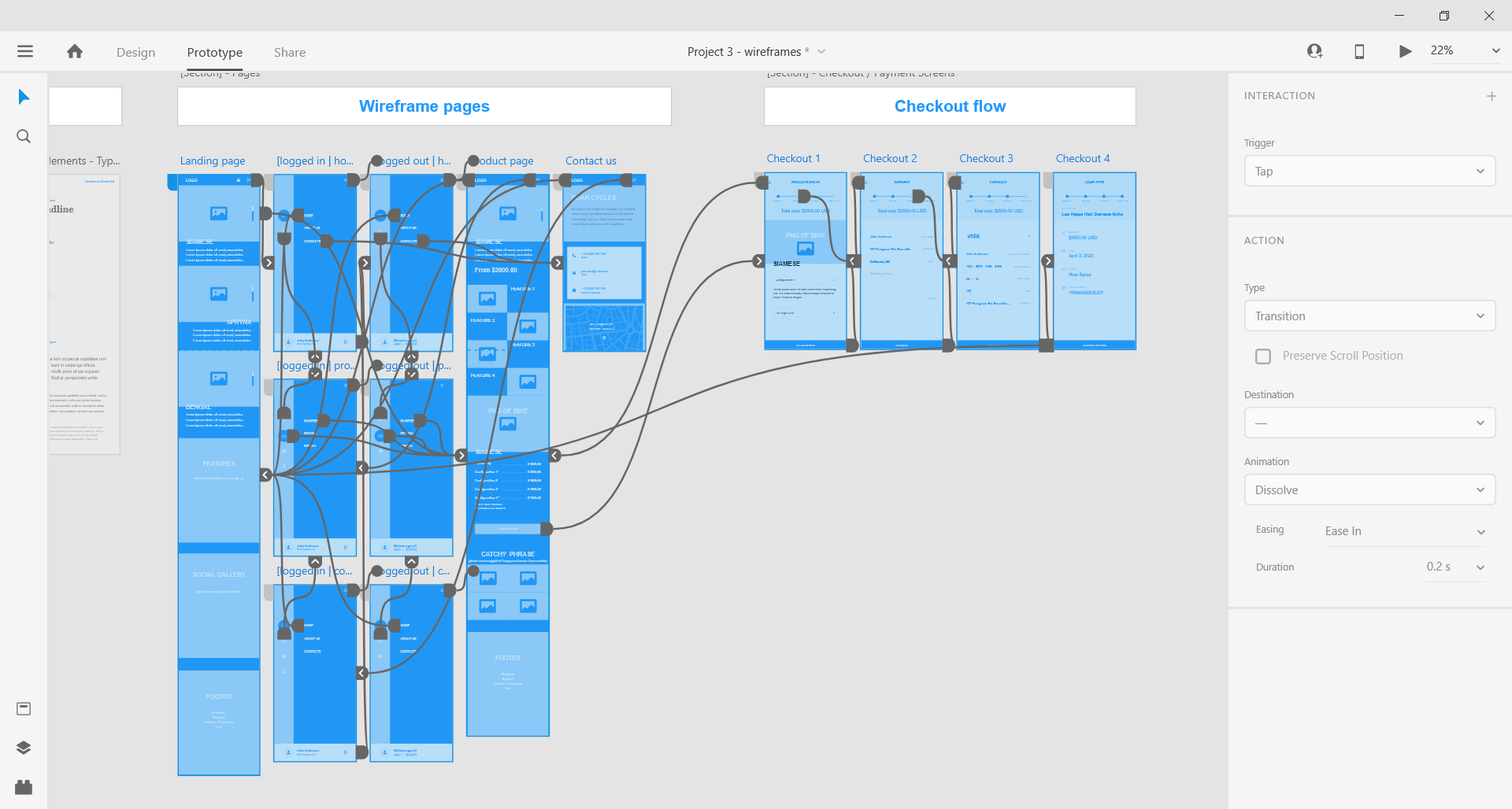
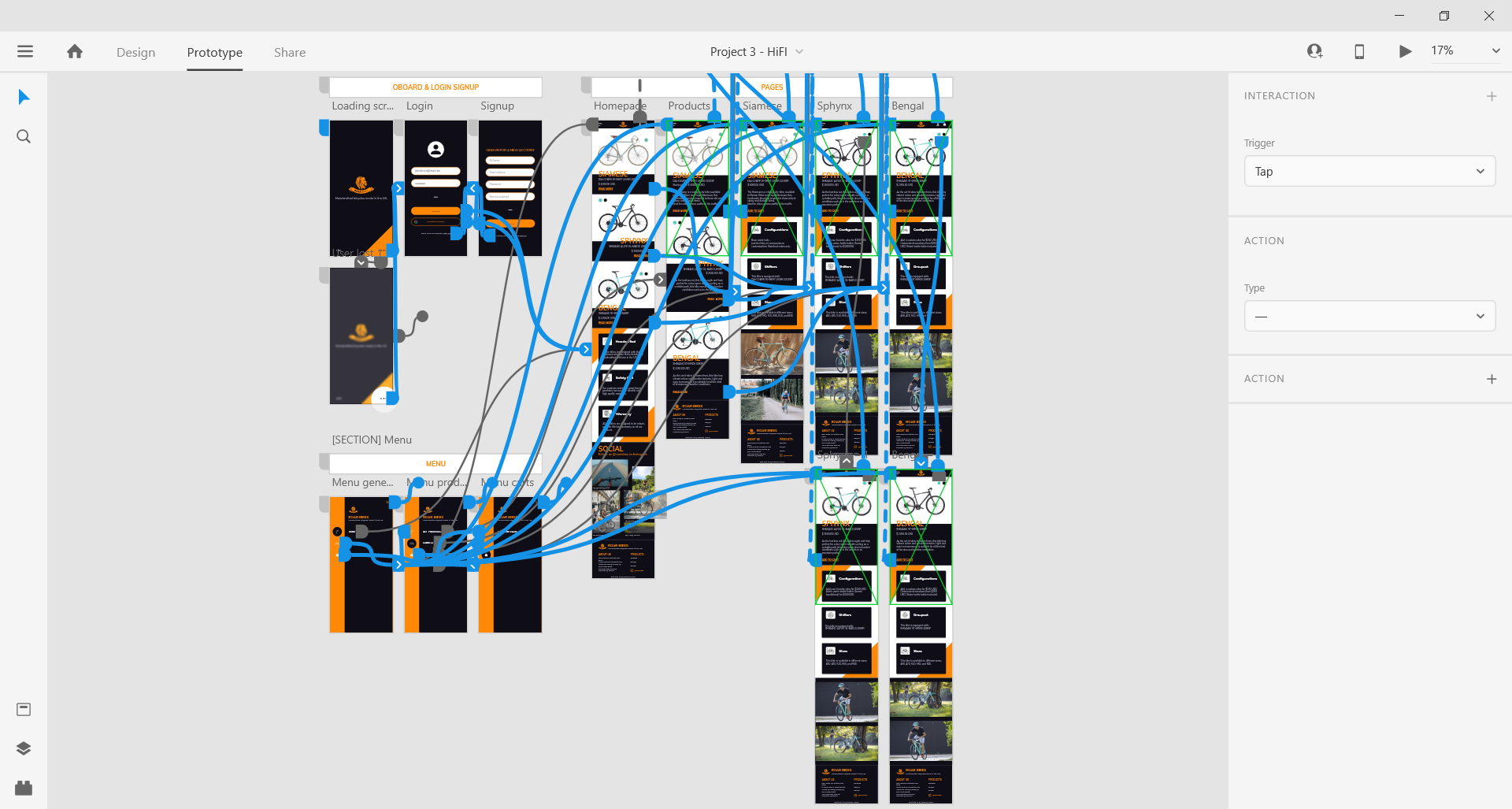
With the wireframes ready, I started creating the hi-fi prototype, with more detailed micro-interactions and a complete navigation, ready for user-testing.
After two quick user tests, where I tested if the users were able to navigate to every page of the website, checkout the details of a particular product, and add it to the cart, I completed the hi-fi prototype.
*Unfortunately, the two images of the bikes (same bike, different color) where slightly different in dimensions, thus the animations looks a bit buggy.
Results
This is the final look of the prototype: if the frame below does not work or you are on a mobile device, use this link instead.
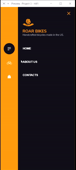
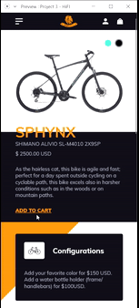
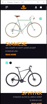
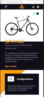
Screenshots
Typography
Font pair: Muli & Muli from Google fonts
Headline: Muli Bold 40pt
Title: Muli Bold 30pt
Subheader: Muli Regular 20pt
Body: Muli Regular 14pt
Secondary body: Muli Regular 12pt
Footer: Muli Regular 10pt
Colors
#FF8906#0F0E17#A7A9BEOur Persona, Jake, is a graphic designer and prides himself on having strange and interesting versions of everyday objects. For this reason, the color palette contains the color orange, that in the psychology of the colors is associated with energy and creativity. It works great to emphasize elements and for call to actions; thus, I used it as an accent color for graphic elements and titles. Furthermore, orange is also associated with DIY and handcrafts, things that Jake loves and cares about.
The Smoky black was chosen mainly to create contrast with the primary color; instead of the classic black #000000 often seen in websites for the body copy,
I opted for a less intense version, that would still create a good contrast. Besides, black is associated with elegance and mystery; Jake likes to have unique things, different
than the other everyday objects.
Finally the Dark Medium Gray is used for the body copy when the background is black to provide a good readability, but, at the same time, to
avoid the blinding effect that pure white #FFFFFF can have on the users.
Possible hindsights
The first time I developed a prototype I used Axure RP; Axure RP is more complex than Adobe and, generally, more time is needed to finalize a prototype.
However, it has additional features and functions that Adobe XD does not have. For instance, in XD it is difficult to create a working mobile menu, because
there is no way to store in a variable the page where the menu was opened. So, in this case, changing the product category creates a bug where it is impossible
to use the "x" button to close the menu, since it will just go to the previous artboard, so the beginning of the animation, instead of closing it.
As other prototyping tools, it does not allow the user to input any textual data, thus, it is difficult sometimes to communicate how the final product
will react upon users entering some texts.
Acknowledgements
- Pictures for the fictional bikes: Bianchi website.
- The Siamese is actually L'Eroica.
- The Sphynx is actually the C-Sport 3.
- The Bengal is actually the C-Sport 2.
- Color palette: Happy Hues, palette #13.
- Icons: Flaticon.
- Font pair: Fontpair.